A storefront that sells before there is a store
A new Bangladeshi leather brand needed somewhere to send customers — product photography, prices and a way to order — before it had inventory systems, payment processing or the volume to justify either. It had to launch on free hosting, be editable by a non-developer, and not look like a template.
The constraint that shaped everything
In Bangladesh, most small-brand commerce happens in a chat window. Customers message a Facebook page or a WhatsApp number, agree a price, and pay cash on delivery. Building a checkout would have added cost, PCI scope and a payment gateway relationship — to serve a behaviour customers weren't asking for.
So ordering runs through messaging. Every product page generates a WhatsApp deep link with the item, colour and price pre-written into the message body, so the customer's first message already contains everything the brand needs to fulfil it. Messenger and Instagram are offered alongside, because preference varies by age bracket.
The trade-off is deliberate and reversible: because product data lives in one structured file, moving to a real cart later means swapping the data source, not rebuilding the front end.
Architecture
Static HTML, CSS and vanilla JavaScript. No framework, no build pipeline, no `node_modules`. The client can open a file, change a number, and see the result — which matters more than developer ergonomics on a project this size.
- One data file. Products, categories, prices, delivery charges and contact handles live in a single JS object. Adding a product is copying a block and dropping three photos in a folder.
- Templated rendering. Grids, filters and the product page are rendered client-side from that data, so there is no duplicated markup to drift out of sync.
- Static content pages. The blog is hand-authored HTML rather than JS-rendered, because crawlers and AI answer engines should never need to execute scripts to read it.
- Deployment. Drag the folder onto any static host. No environment variables, no runtime.
Performance
Source photography arrived as 34MB of phone JPEGs. Those were re-encoded to progressive JPEG at display resolution and cropped into two derivatives per image — a square for grids and a full-frame for detail views — bringing the whole site under 4MB.
- Explicit
widthandheighton every image, so nothing shifts as the page loads. - Hero image preloaded with
fetchpriority="high"; everything below the fold lazy-loaded and asynchronously decoded. - Art direction by breakpoint — desktop gets a wide crop composed for a landscape frame, phones get the original portrait, via
<picture>rather than CSS cropping. - Images fade in only once decoded, so the page never shows a half-drawn photo.
Accessibility
Built to WCAG 2.1 AA thinking rather than retrofitted to it.
- Skip link, single
<main>landmark and a logical heading order on every page. - Visible
:focus-visiblerings throughout; the mobile drawer manages focus, exposesaria-expanded, and closes on Escape. - Body and accent colours tested against the dark background — the muted text runs about 6:1 and the tan accent about 7:1, both clear of the 4.5:1 requirement.
- Decorative photography is marked
aria-hidden; product images carry descriptive alt text generated from the product data. prefers-reduced-motiondisables every transition, animation and smooth scroll.
Search and answer engines
A new domain cannot outrank marketplaces on "leather wallet". It can own the questions those marketplaces don't answer.
- Three long-form guides targeting real local intent — price bands, spotting genuine leather, and surviving monsoon humidity.
- Every post opens with a short answer block: the question answered plainly in the first hundred words, which is the passage search engines lift for featured snippets and that AI assistants quote.
ArticleandFAQPagestructured data, with the schema FAQs mirroring the visible ones exactly.Storeschema on the home page, canonical URLs, sitemap, and arobots.txtthat explicitly welcomes GPTBot, ClaudeBot and PerplexityBot as well as Googlebot.
Design
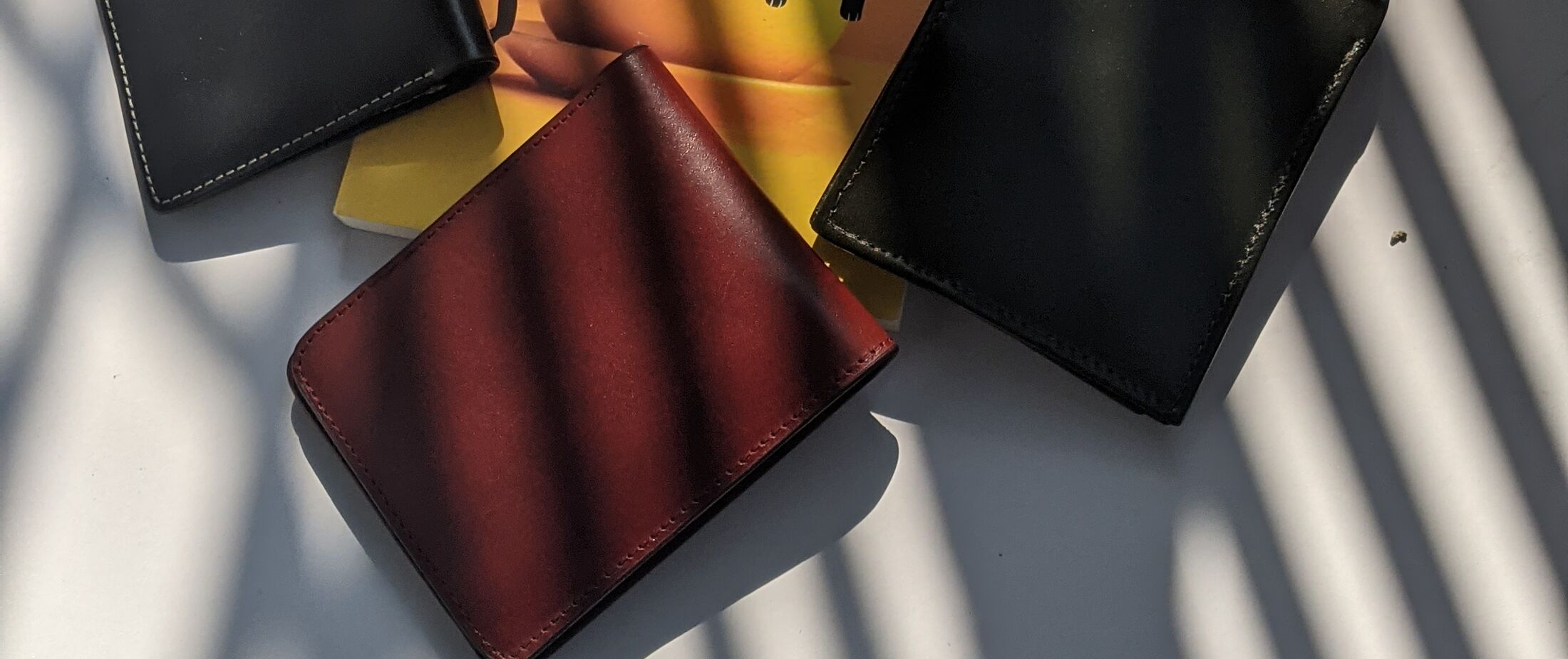
The identity is built around the client's own photography — natural light, hard window shadows, a warm off-white surface. A dark charcoal shell with a single tan accent lets those photographs be the only source of colour on the page. Headings are set in a heavy grotesk, with a serif reserved for the wordmark alone.
The system is deliberately small: two typefaces, five colour tokens, one radius, one hairline. Consistency at that scale is what stops a small catalogue looking thin.
Stack
- Semantic HTML
- Modern CSS
- Vanilla JS
- JSON-LD
- Responsive art direction
- WCAG 2.1 AA
- Static hosting